On Figures
The Problem
In communication theory literatures, it is very likely that the numerical sections involves some sort of Monte-Carlo simulations over multiple attributes. These figures are usually generated from matplotlib or matlab and in my opinion, 80% of figures are just terrible. In general of course, there is an element of subjectivity to assess the standard of figures, but I think there are also several conventional wisdoms.
In what follows I offer some of my tips and unresolved troubles on generating (imo) beautiful figures; this will not focus on technical details on what specific figures are about or their accompanying smoothness, but some general rules. I will use matlab generated figures as example, although it is readily applied to other forms such as matplotlib.
Example
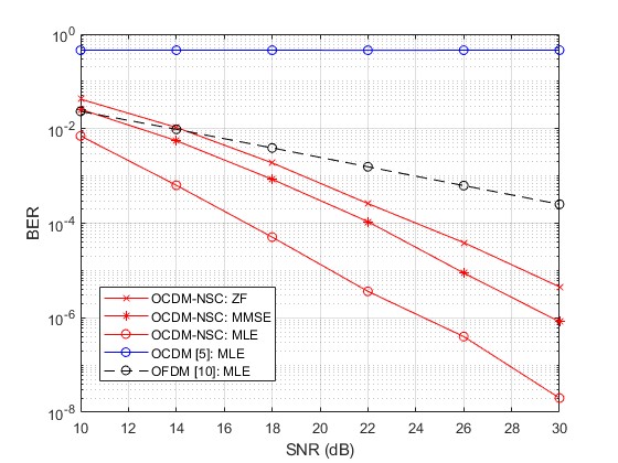
I used to make figures like this, which on the surface looks pretty clean, might even be better than a lot of figures one finds on journals. But there are several issues.
To illustrate, take a look at the following figure, which is completely meaningless.
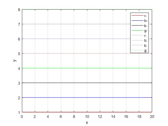
Here are my problems with the figure:
- LineWidth not matched: Typically, certain lines appear thinner than others when generated, hence adjustments must be made.
- Width to height ratio not optimal.
- Too many legends: In my opinion, 6 is the maximum of legends for a graph to be athestically pleasing, 8 is maybe stretching it already.
- Insufficient use of markers, for discretely generated figures.
- Raster graphics are not good in published form, especially in latex; I would recommend vector graphics like eps.
- Green is just not a good color in my opinion. Colors that are on lighter scale do not suit figures due to human perception reasons on white background, I only use red/black/blue some combination of those.
- Font and Word Style not optimal (Times New Roman)
So let’s take a look at each one of them. First is very trivial, dotted line needs to be scaled up by a factor of 1.5 in general.
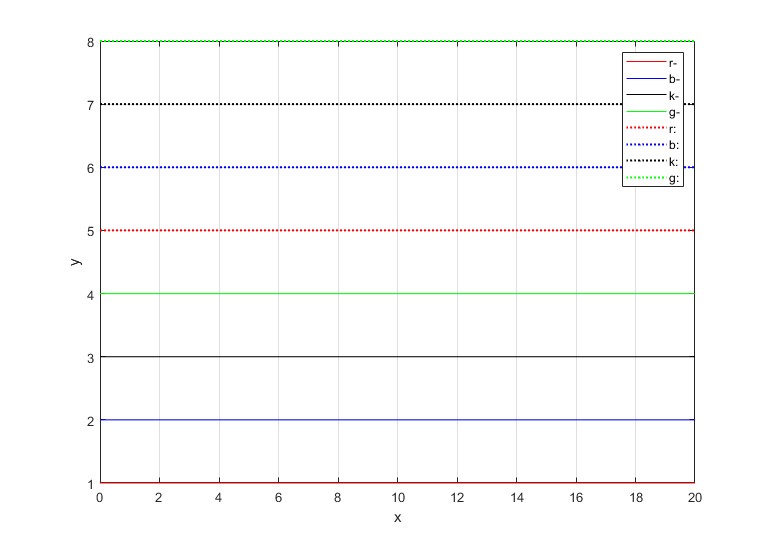
However, constant disagreements there are, with regard to the best width to height ratio. Apart from the matlab default ratio which is 4:3, let’s take a look at some options: 1. Square plot. 2. Golden Ratio 1:0.618. 3. 16:9 4. sqrt(2):1
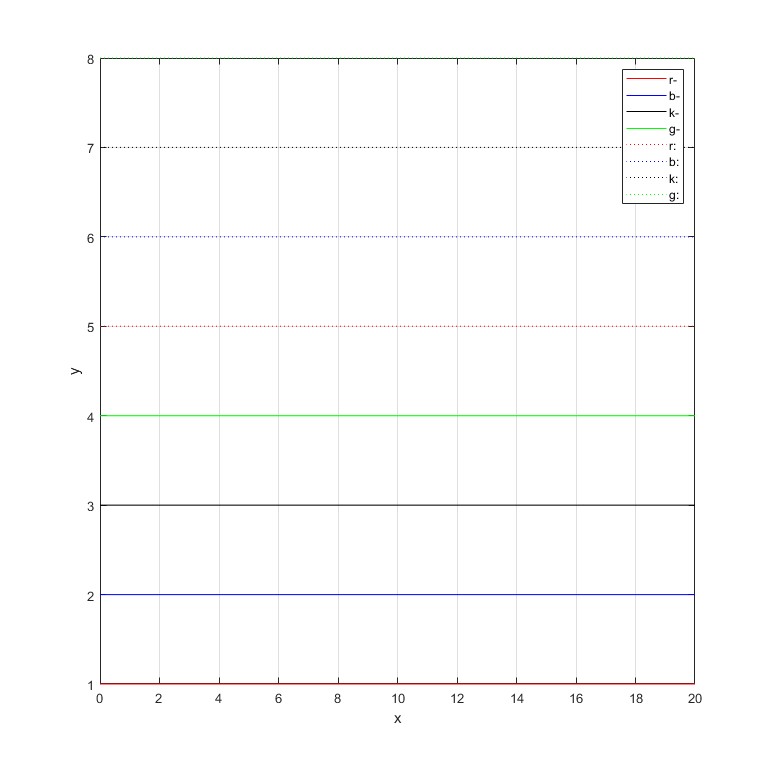
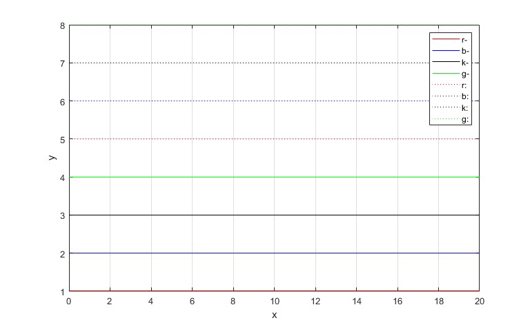
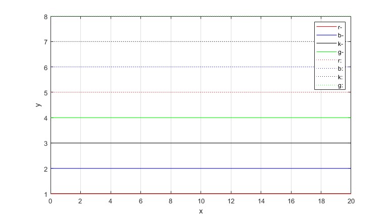
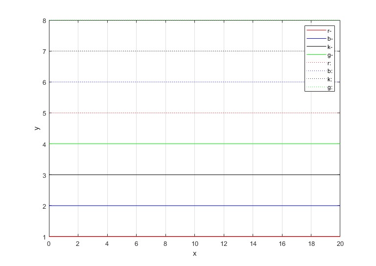
My personal preference is sqrt(2):1, the hypothesis is that when people read figures that are partitioned in the middle via axises, as bilateral species, sub blocks with same ratio trigger some sort of psyiological response. sqrt(2):1 plots have this property and I think they are for me most comfortable.
Now let’s take a look at a figure with markers introduced
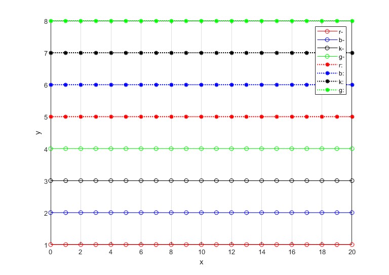
This figure is plotted over two attributes separated by color and line+marker combination. One very easy solution to reduce two legends is to separate two features like following examples, which is very unconventional, but there is no optimal solution to this since there is no true color/marker/line neutralness. Whenever an attribute is abstracted in legend, it has to use some color/marker/line, which is not general. I have not come up with a way to bypass this issue.
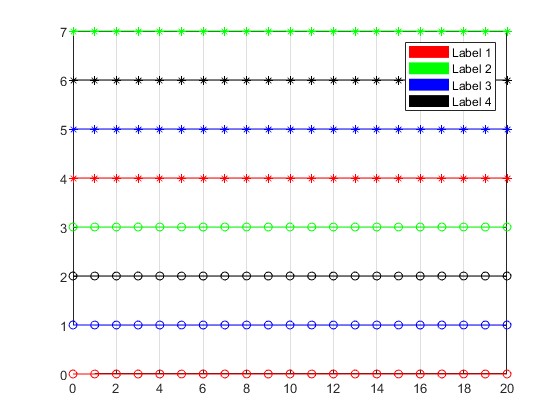
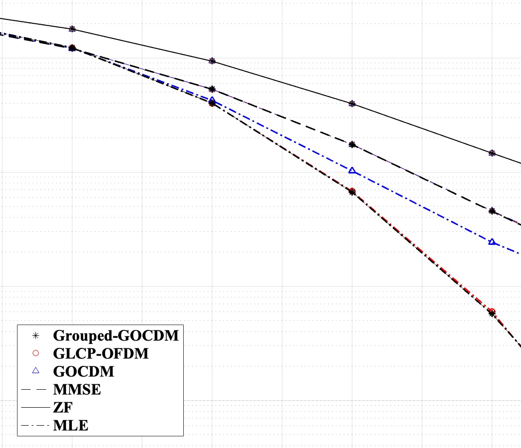
The problem is the following: in the first fig above, there are 8 legends as a combination of two features of dimension 4 and 2 each. Theoretically, and often pratically, we can restrict the number of legends to the sum of all dimensions. In the second Fig above (I can’t show the entire Figure for reasons), the figure is plotted over 2 feature with alphabet size 3 each, in enumeration it would require 9 legends which is just unbearable. Instead, it can be plotted using feature space elements only. However, the problem is for instance, ZF is associated with solid line, but whenever it is shown in legend, it has to be associated with some color, in this case black, which is not a neutral color, since it is associated with first element of first feature (Grouped-GOCDM).
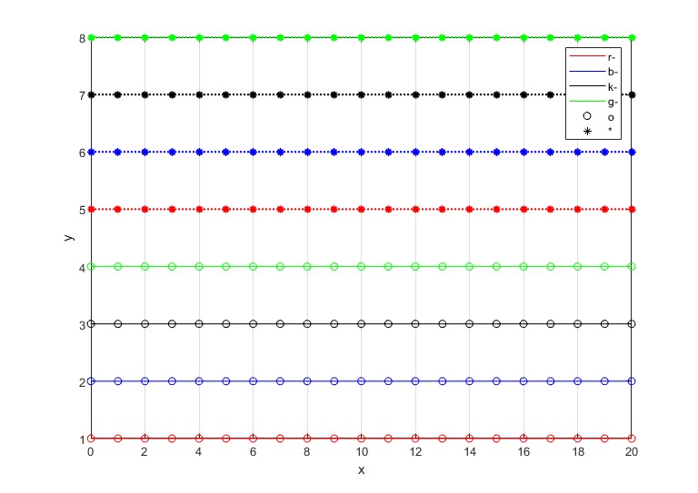
Whenever a feature is associated with only one/two figure element out of (marker, color, linetype), it creates a problem of presentation. Atlas, marker and linetype are less of a problem since they can assume weak neutrality with a color like black, but what if one wants to represent a figure that is explicitly and only associated with color? It seems very difficult since there is no color block to use, or is there?
The third figure in the slider above is the solution to this problem, but it is a aesthetically horrible solution. So I think the conclusion is to not explicitly associate a feature to only color, and it creates certain design decisions one has to make in simulations.
Attached is my figure formatting handler, note that this is applied AFTER the actual figure has been generated, and is only a tool for graphical consistency.
fig = gcf;
set(findall(fig, '-property', 'FontName'), 'FontName', 'Times New Roman');
set(findall(fig, '-property', 'FontSize'), 'FontSize', 12);
ax = gca;
set(ax.XLabel, 'FontSize', 18);
set(ax.YLabel, 'FontSize', 18);
legendHandle = findobj(fig, 'Type', 'legend');
if ~isempty(legendHandle)
    set(legendHandle, 'FontWeight', 'bold');
    set(legendHandle, 'FontSize', 16);
end
set(fig, 'WindowStyle', 'normal');
currentPosition = get(fig, 'Position');
newHeight = 500;
newWidth = newHeight * sqrt(2);
set(fig, 'Position', [currentPosition(1), currentPosition(2), newWidth, newHeight]);
Enjoy Reading This Article?
Here are some more articles you might like to read next: